> ## Documentation Index
> Fetch the complete documentation index at: https://turnkey-0e7c1f5b-onramp-quick-fix.mintlify.site/llms.txt
> Use this file to discover all available pages before exploring further.
# Embedded Wallet Kit (EWK)
> Turnkey offers a suite of react components to create embedded wallets without having to setup a backend by using Next.js [server actions](https://nextjs.org/docs/app/building-your-application/data-fetching/server-actions-and-mutations) and associated directives. Each component uses the **indexedDbClient** from [@turnkey/sdk-react](https://www.npmjs.com/package/@turnkey/sdk-react).
An example is hosted [here](https://wallets.turnkey.com/), and reference to the code can be found [here](https://github.com/tkhq/demo-ewk).
## How to Use Turnkey EWK
To use the embedded wallet kit effectively, your project is required to:
1. Use **Next.js 13+** with the [/app directory structure](https://nextjs.org/docs/app) to leverage server actions.
2. Import Turnkey's default styles in your `layout.tsx` or equivalent entry point:
```js
import "@turnkey/sdk-react/styles";
```
3. **Set up environment variables** in your `.env` file to configure API connections and optional OAuth providers.
**Environment Variables**:
| Variable | Description |
| -------------------------------- | ---------------------------------------------------------------------------------------------------------------------------- |
| `TURNKEY_API_PUBLIC_KEY` | Your Turnkey API public key *(required)*. |
| `TURNKEY_API_PRIVATE_KEY` | Your Turnkey API private key *(required)*. |
| `NEXT_PUBLIC_BASE_URL` | Base URL for Turnkey API *(default: `https://api.turnkey.com`)*. |
| `NEXT_PUBLIC_ORGANIZATION_ID` | Your Turnkey organization ID *(required)*. |
| `NEXT_PUBLIC_EXPORT_IFRAME_URL` | URL for the Turnkey wallet export iframe *(default: `https://export.turnkey.com`)*. |
| `NEXT_PUBLIC_IMPORT_IFRAME_URL` | URL for the Turnkey wallet import iframe *(default: `https://import.turnkey.com`)*. |
| `NEXT_PUBLIC_GOOGLE_CLIENT_ID` | Google OAuth Client ID *(required only if enabling Google login in `authConfig`)*. |
| `NEXT_PUBLIC_APPLE_CLIENT_ID` | Apple OAuth Client ID *(required only if enabling Apple login in `authConfig`)*. |
| `NEXT_PUBLIC_FACEBOOK_CLIENT_ID` | Facebook OAuth Client ID *(required only if enabling Facebook login in `authConfig`)*. |
| `NEXT_PUBLIC_OAUTH_REDIRECT_URI` | OAuth Redirect URI *(required only if enabling Google, Apple, or Facebook login, e.g., `https://your-app.ngrok-free.app/`)*. |
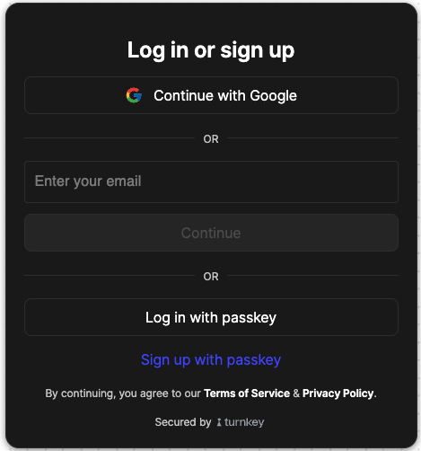
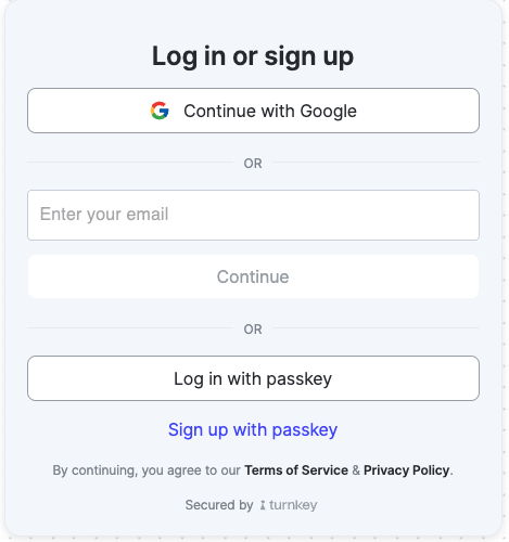
## **1. Authentication with the `Auth` Component**
The `Auth` component provides authentication functionality, including email, passkey, phone, and social logins.
**Usage Example**:
```js
import { Auth } from "@turnkey/sdk-react";
import { toast } from "sonner";
function AuthPage() {
const handleAuthSuccess = async () => {
console.log("Auth successful!"); // You can now use your indexedDbClient to make requests!
};
const handleAuthError = (errorMessage: string) => {
toast.error(errorMessage);
};
const authConfig = {
emailEnabled: true,
passkeyEnabled: true,
phoneEnabled: false,
googleEnabled: true,
appleEnabled: false,
facebookEnabled: false,
};
const configOrder = ["socials", "email", "phone", "passkey"];
return (
);
}
export default AuthPage;
```
Your component should look like the below
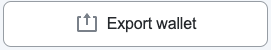
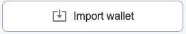
 ## **2. Importing and Exporting Wallets**
The `Import` and `Export` components allow users to import or export wallets securely.
**Import Wallet Example**:
```js
import { Import } from "@turnkey/sdk-react";
import { toast } from "sonner";
function ImportWallet() {
const handleImportSuccess = async () => {
toast.success("Wallet successfully imported!");
};
const handleImportError = (errorMessage: string) => {
toast.error(errorMessage);
};
return (
);
}
export default ImportWallet;
```
**Export Wallet Example**:
```js
import { Export } from "@turnkey/sdk-react";
import { toast } from "sonner";
function ExportWallet() {
const walletId = "your-wallet-id";
const handleExportSuccess = async () => {
toast.success("Wallet successfully exported!");
};
const handleExportError = (errorMessage: string) => {
toast.error(errorMessage);
};
return (
);
}
export default ExportWallet;
```
Your components should look like the below
## **2. Importing and Exporting Wallets**
The `Import` and `Export` components allow users to import or export wallets securely.
**Import Wallet Example**:
```js
import { Import } from "@turnkey/sdk-react";
import { toast } from "sonner";
function ImportWallet() {
const handleImportSuccess = async () => {
toast.success("Wallet successfully imported!");
};
const handleImportError = (errorMessage: string) => {
toast.error(errorMessage);
};
return (
);
}
export default ImportWallet;
```
**Export Wallet Example**:
```js
import { Export } from "@turnkey/sdk-react";
import { toast } from "sonner";
function ExportWallet() {
const walletId = "your-wallet-id";
const handleExportSuccess = async () => {
toast.success("Wallet successfully exported!");
};
const handleExportError = (errorMessage: string) => {
toast.error(errorMessage);
};
return (
);
}
export default ExportWallet;
```
Your components should look like the below
 Import
 ## **3. Optional: Customizing Themes with `TurnkeyThemeProvider`**
The `TurnkeyThemeProvider` allows you to apply custom styles using CSS variables. This is optional and can be used to customize Turnkey components to match your application's design.
**Usage Example**:
```js
import { TurnkeyThemeProvider } from "@turnkey/sdk-react";
const customTheme = {
"--text-primary": "#333333",
"--button-bg": "#4c48ff",
"--button-hover-bg": "#3b38e6",
};
export default function App() {
return (
);
}
```
You can customize any CSS variable used by Turnkey components. For the full list of available variables, refer to the [this .css file](https://github.com/tkhq/sdk/blob/main/packages/sdk-react/src/components/theme.css) Below is an example of a dark mode theme.
## **3. Optional: Customizing Themes with `TurnkeyThemeProvider`**
The `TurnkeyThemeProvider` allows you to apply custom styles using CSS variables. This is optional and can be used to customize Turnkey components to match your application's design.
**Usage Example**:
```js
import { TurnkeyThemeProvider } from "@turnkey/sdk-react";
const customTheme = {
"--text-primary": "#333333",
"--button-bg": "#4c48ff",
"--button-hover-bg": "#3b38e6",
};
export default function App() {
return (
);
}
```
You can customize any CSS variable used by Turnkey components. For the full list of available variables, refer to the [this .css file](https://github.com/tkhq/sdk/blob/main/packages/sdk-react/src/components/theme.css) Below is an example of a dark mode theme.